Project: New Band - MAPI
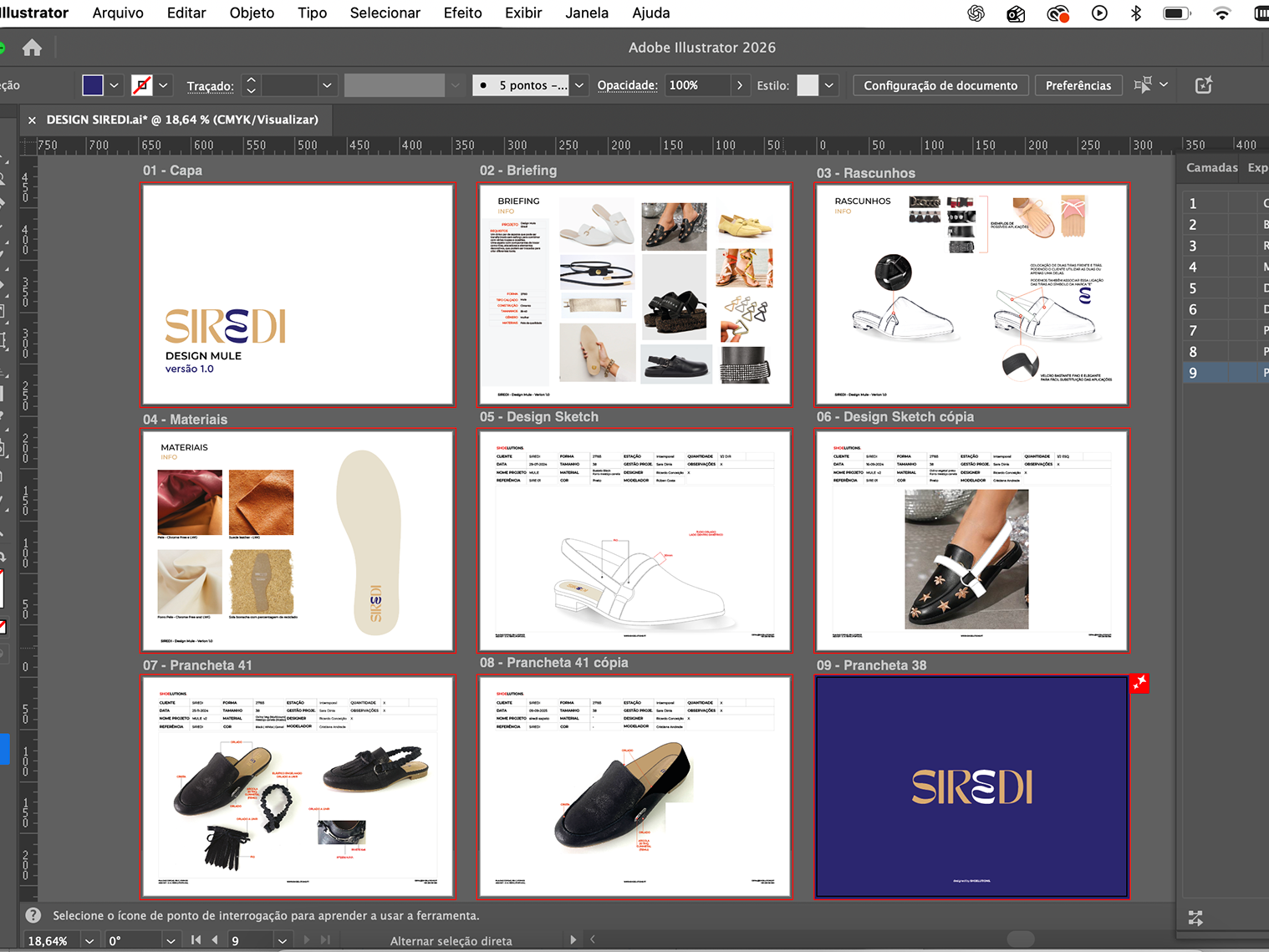
Develop the brand and identity manual and all visual identity.
Brand goals:
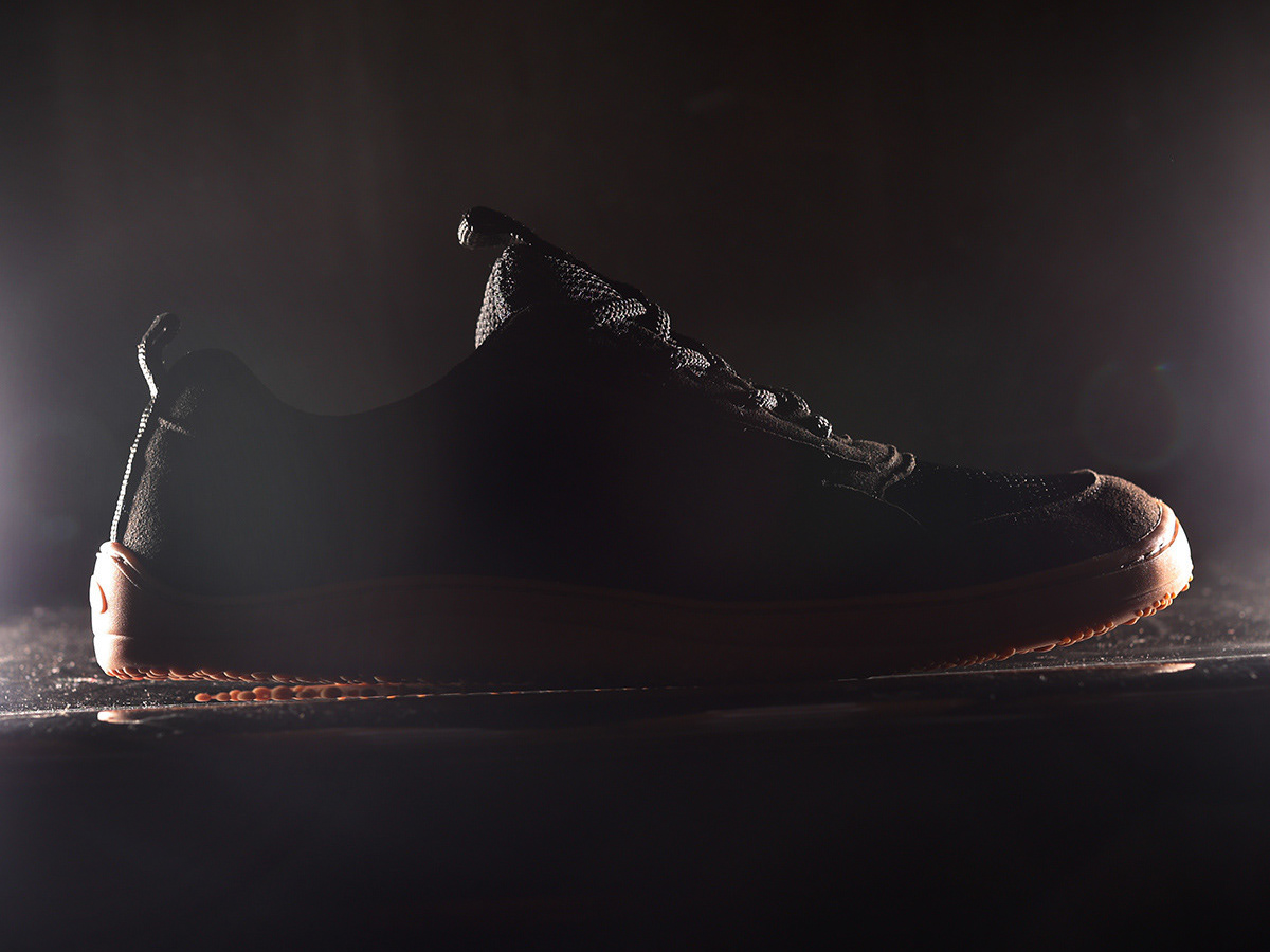
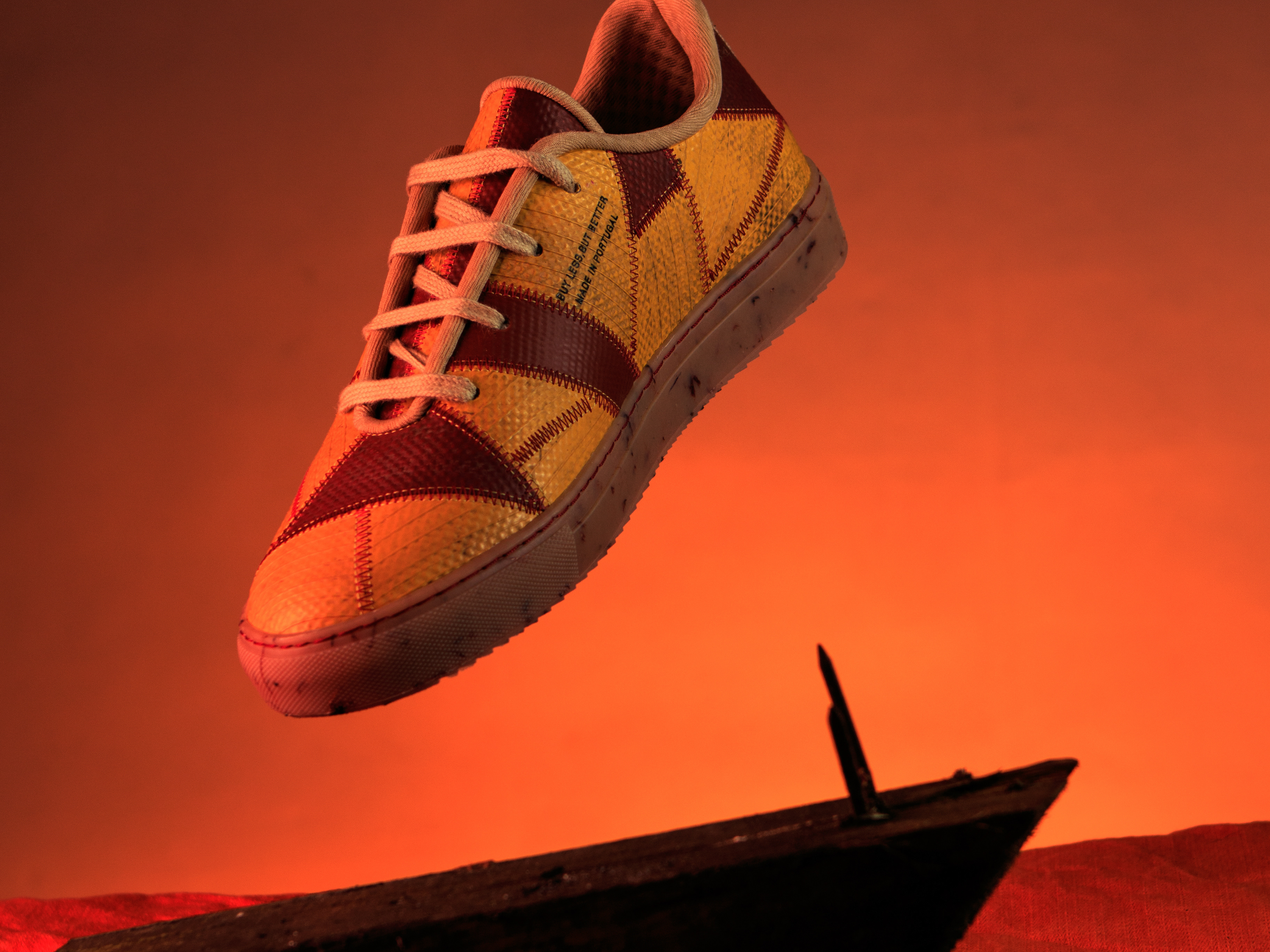
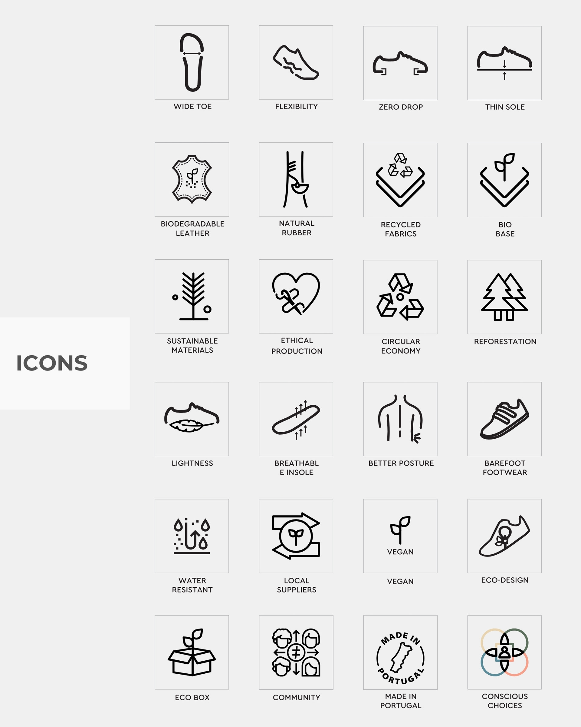
1. Raise awareness of the benefits of wearing barefoot shoes.
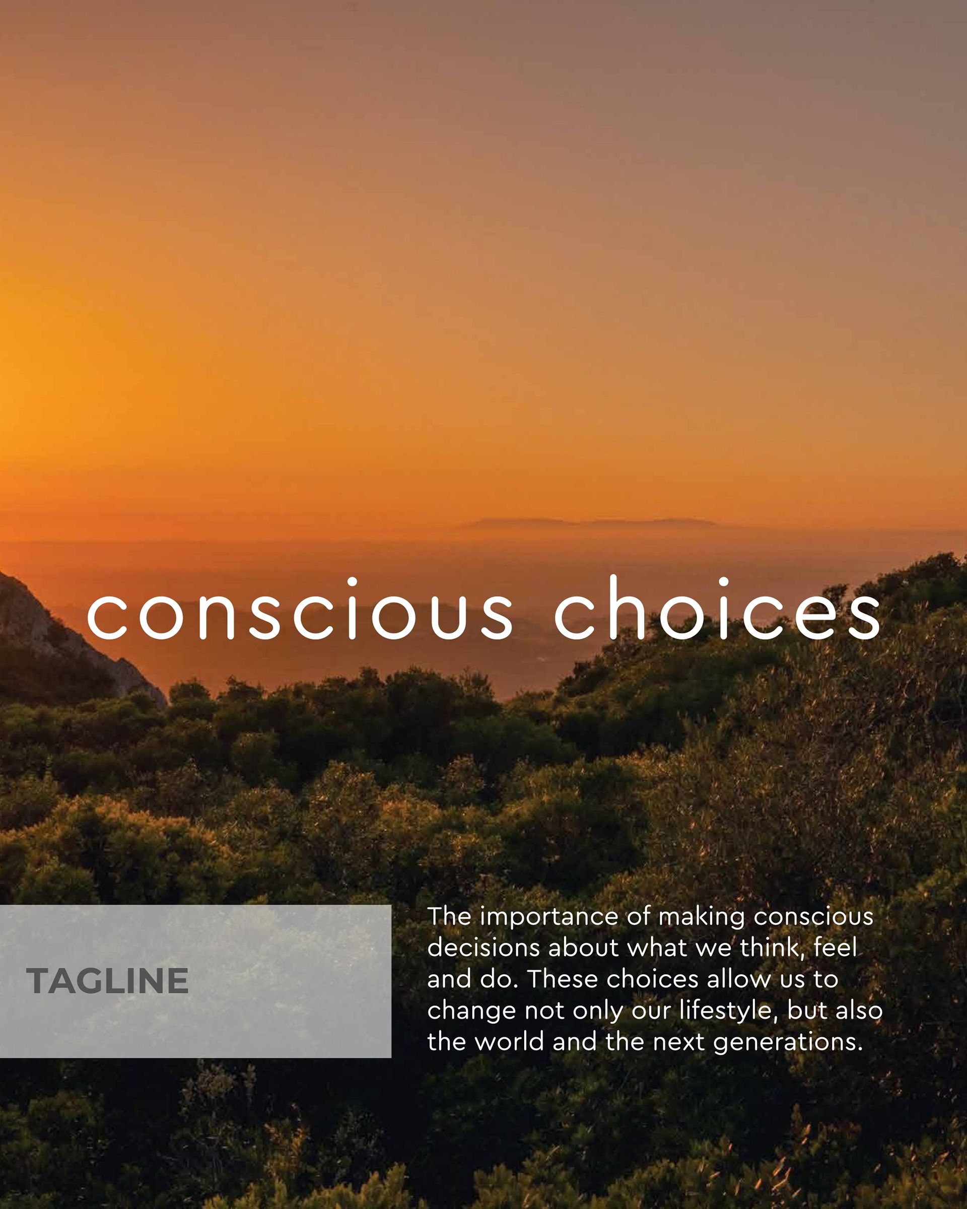
2. Show the world that change is possible, choices can be made with respect for people and the planet.
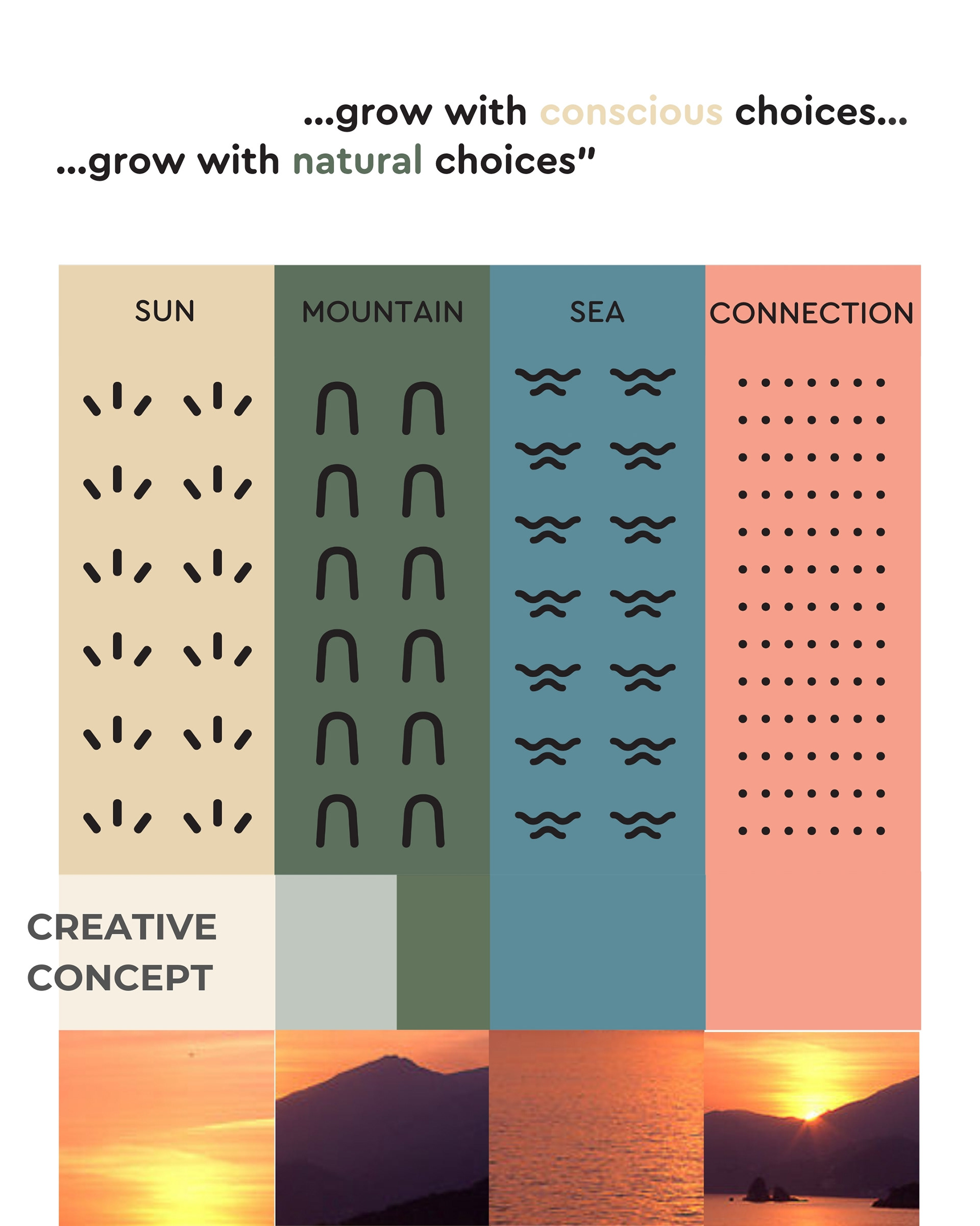
3. Unite people along the value chain, from material suppliers, to factory workers, shopkeepers and consumers, reconnecting the links between those who produce, sell and buy.
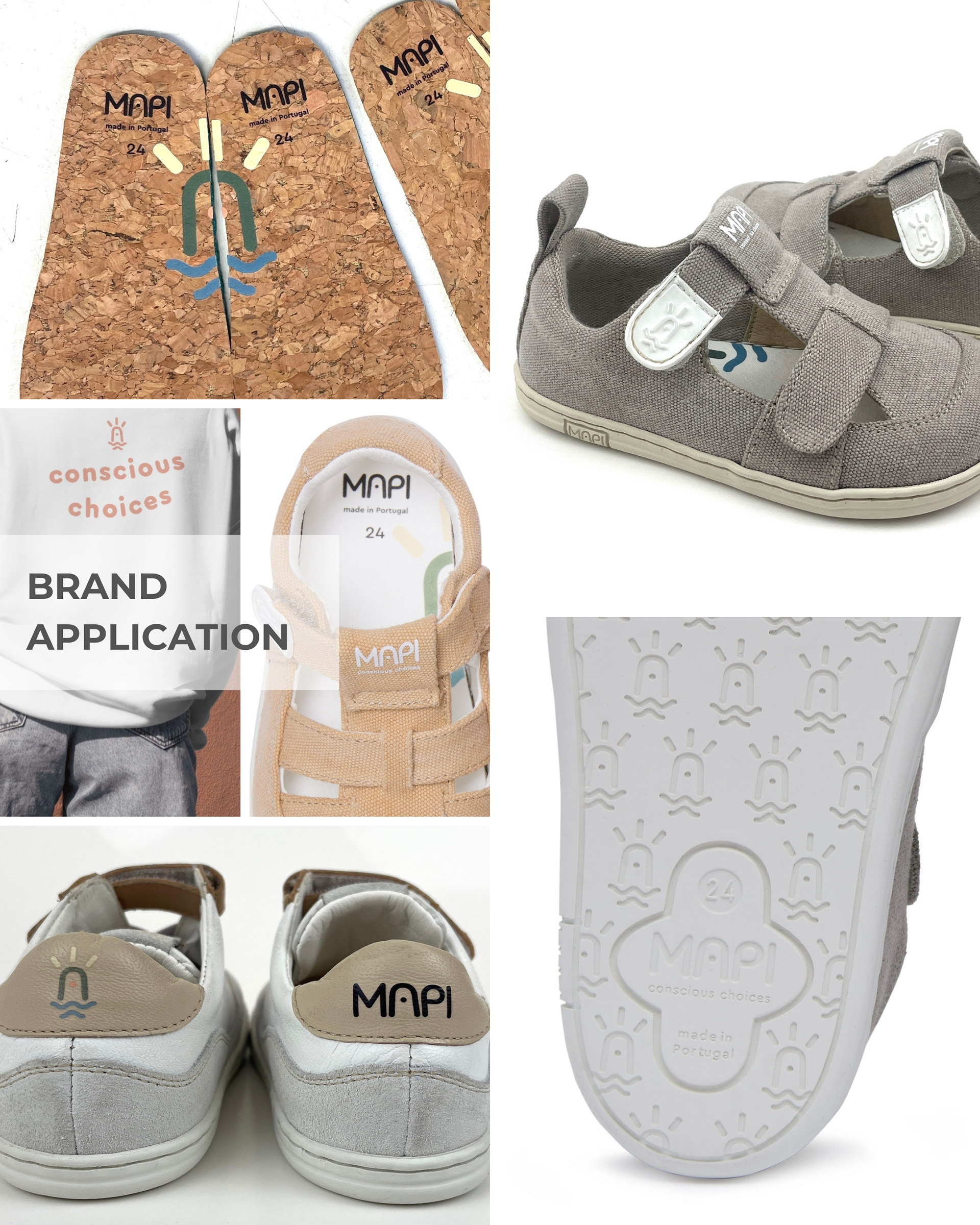
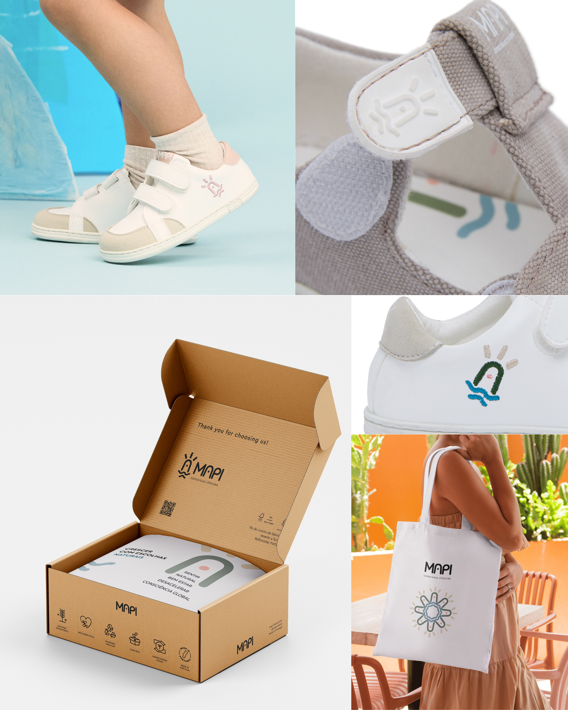
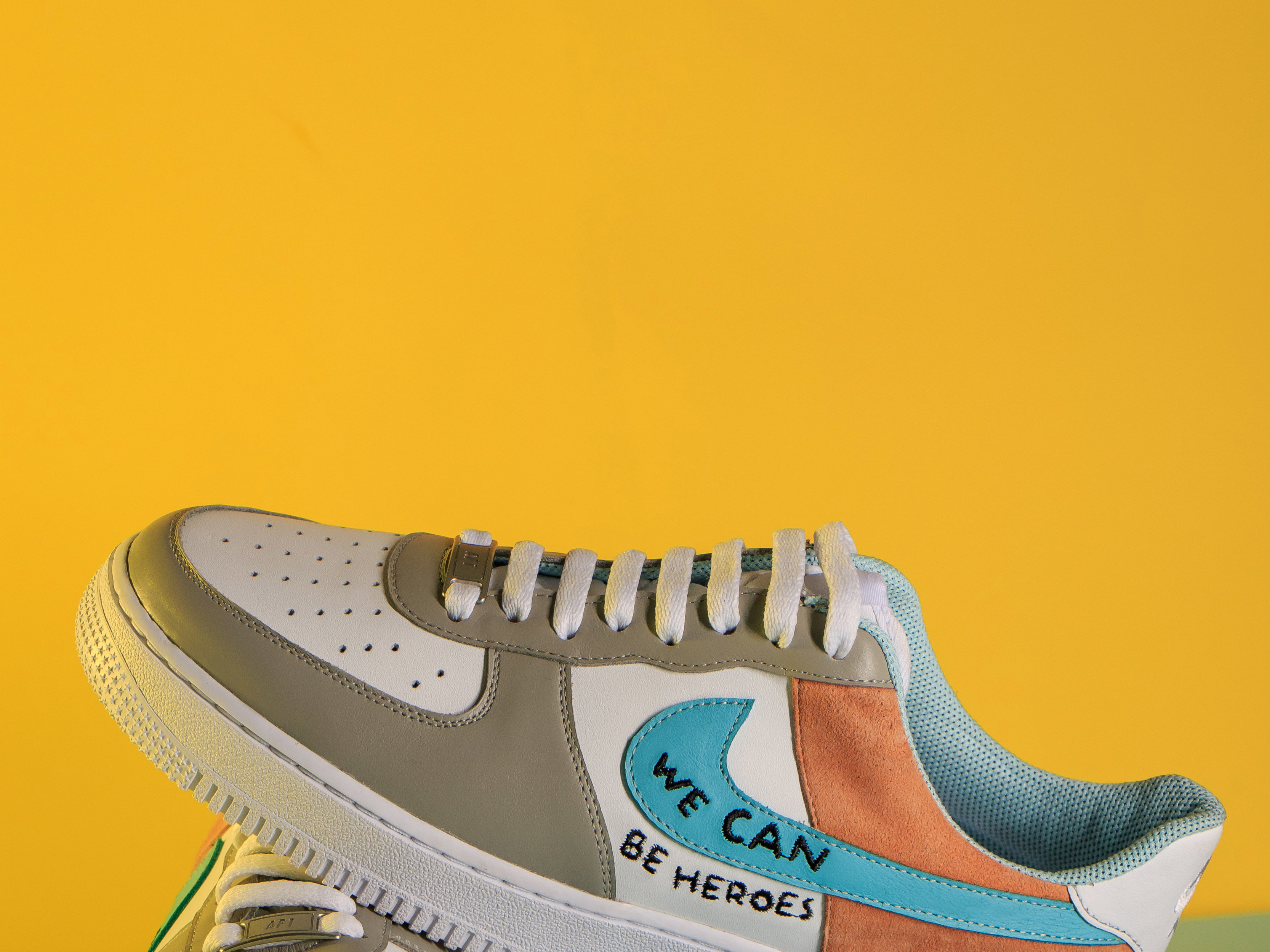
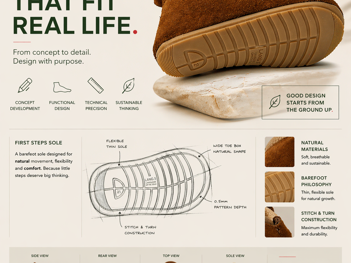
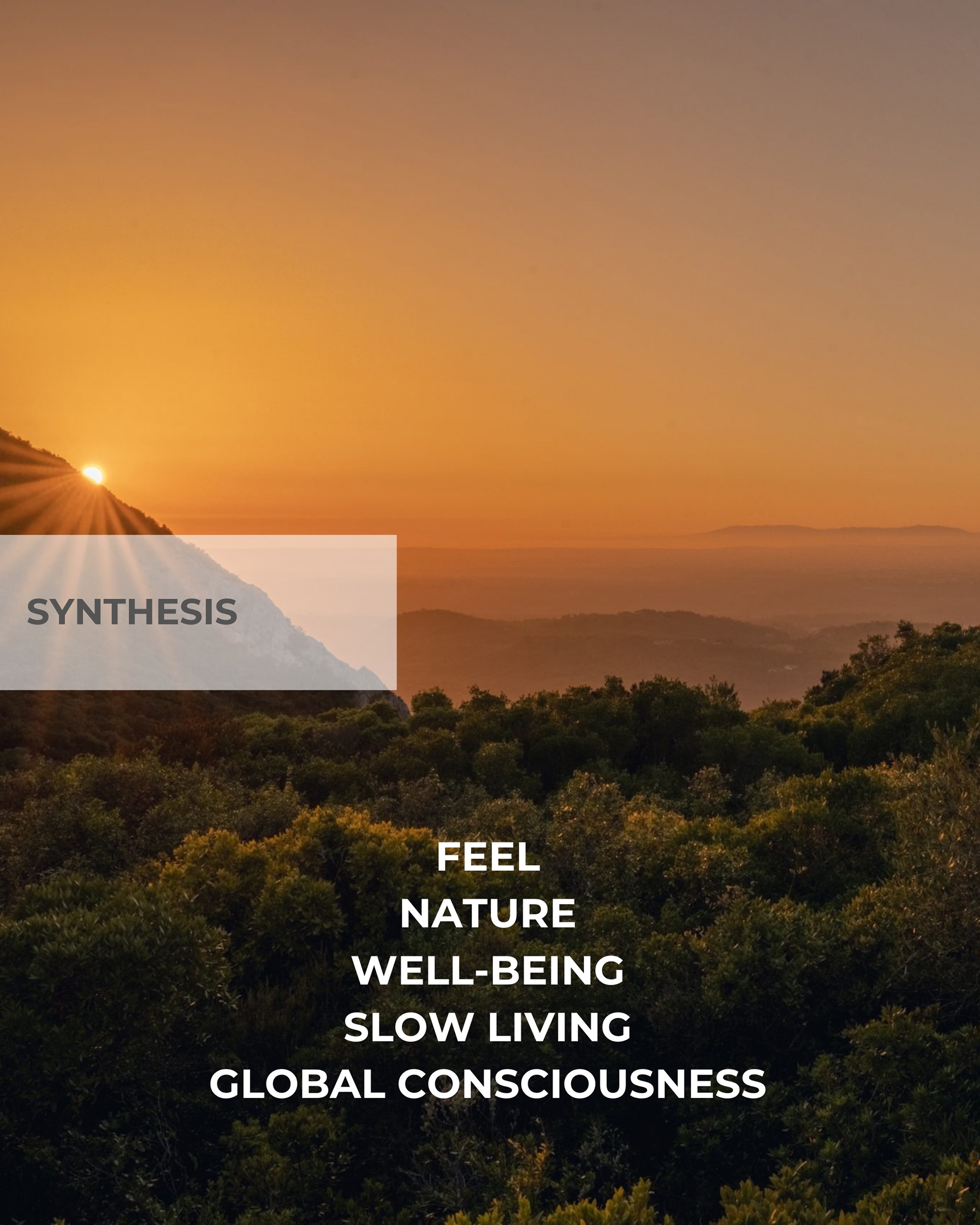
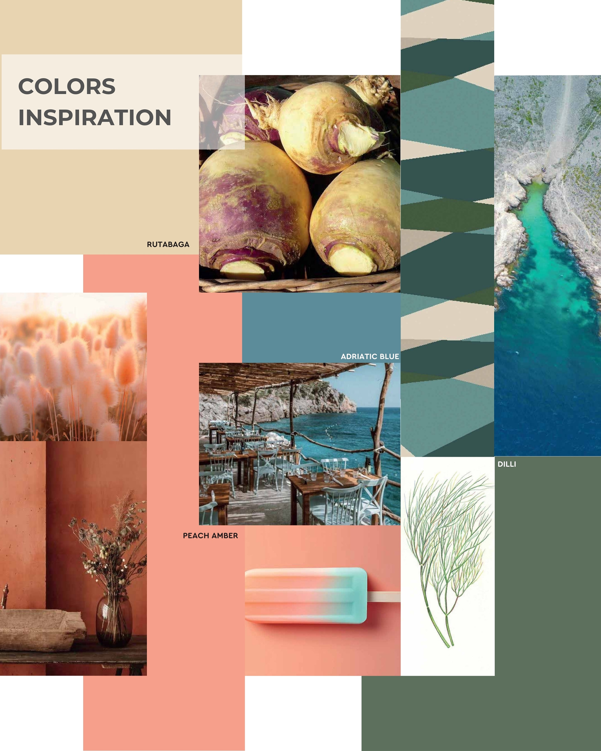
The logo defines the basis of the brand concept, which nurtures a connection with its customers and provides them with the best natural and healthy walking experience.
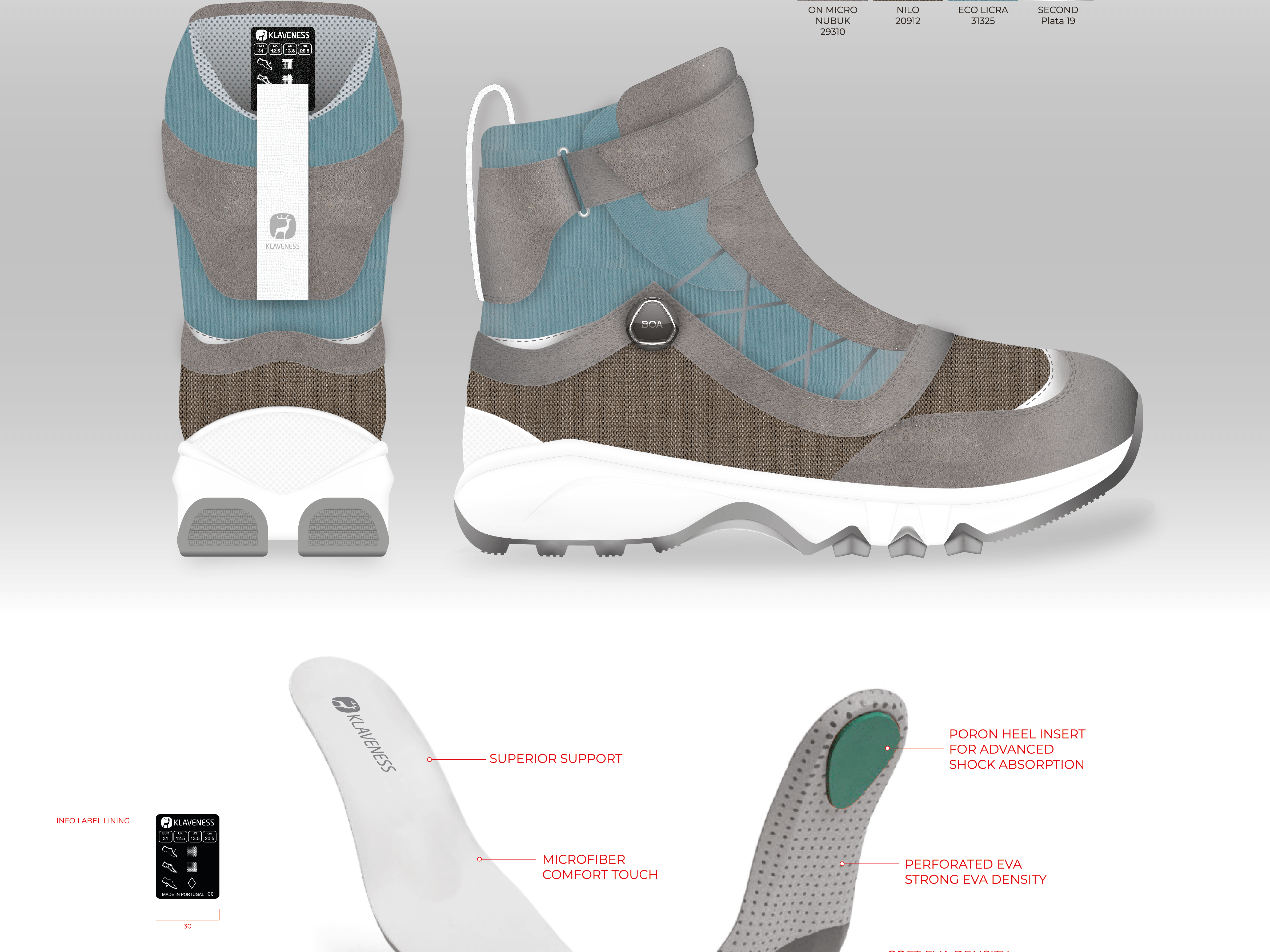
From the choice of materials to sizes, there is a constant search and monitoring for well-being.
It is in this simplicity associated with all the other brand values that we intend to have our main competitive advantage, establishing close contact with customers.
Because anything can be copied, but authenticity and transparency with a genuine connection is simply impossible to replicate.
Because anything can be copied, but authenticity and transparency with a genuine connection is simply impossible to replicate.
#barefootshoes #footwear #branding #design #productidentity #labels #mockup #packaging #engraving #logodesign #logotype #identitymanual #visualidentity
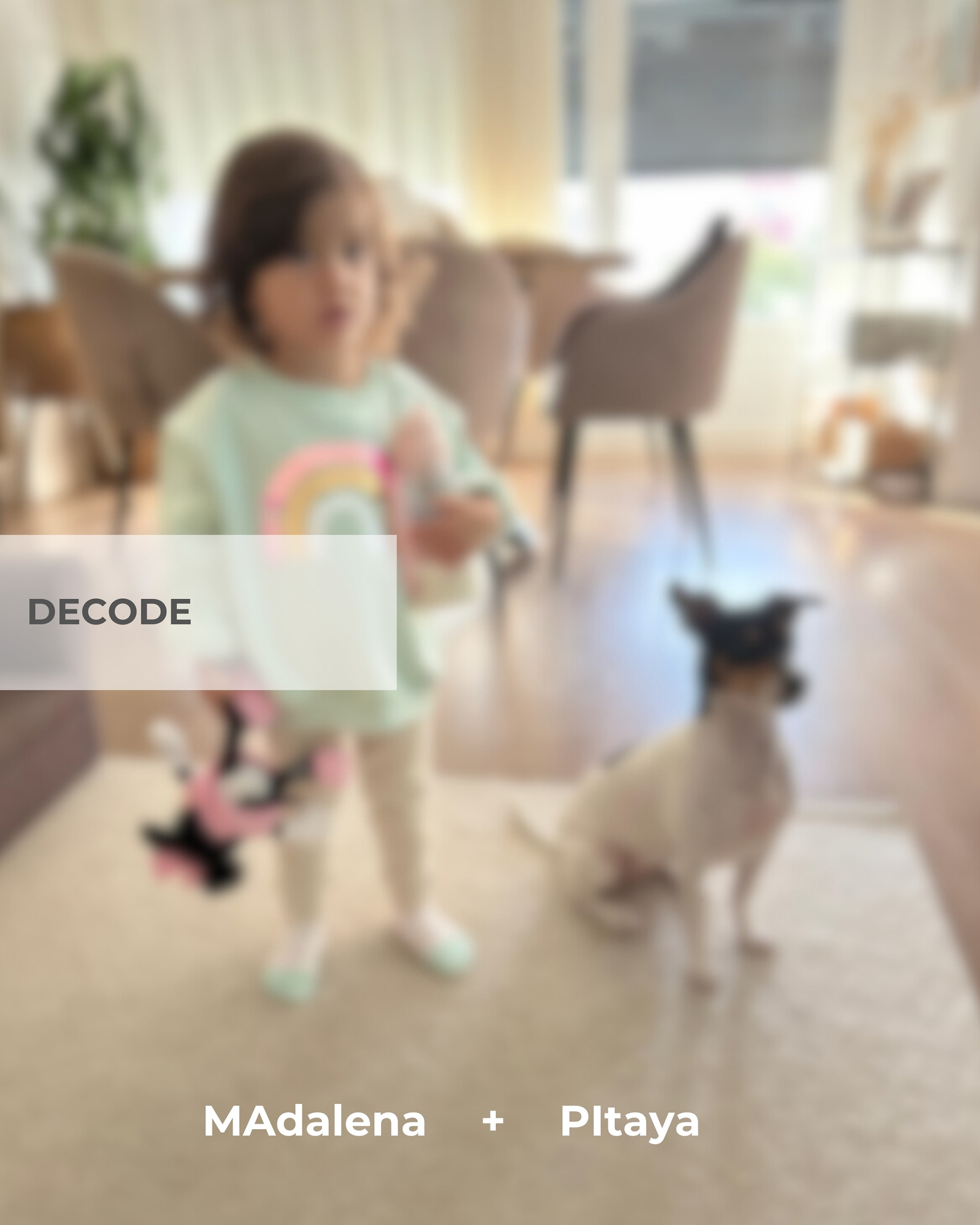
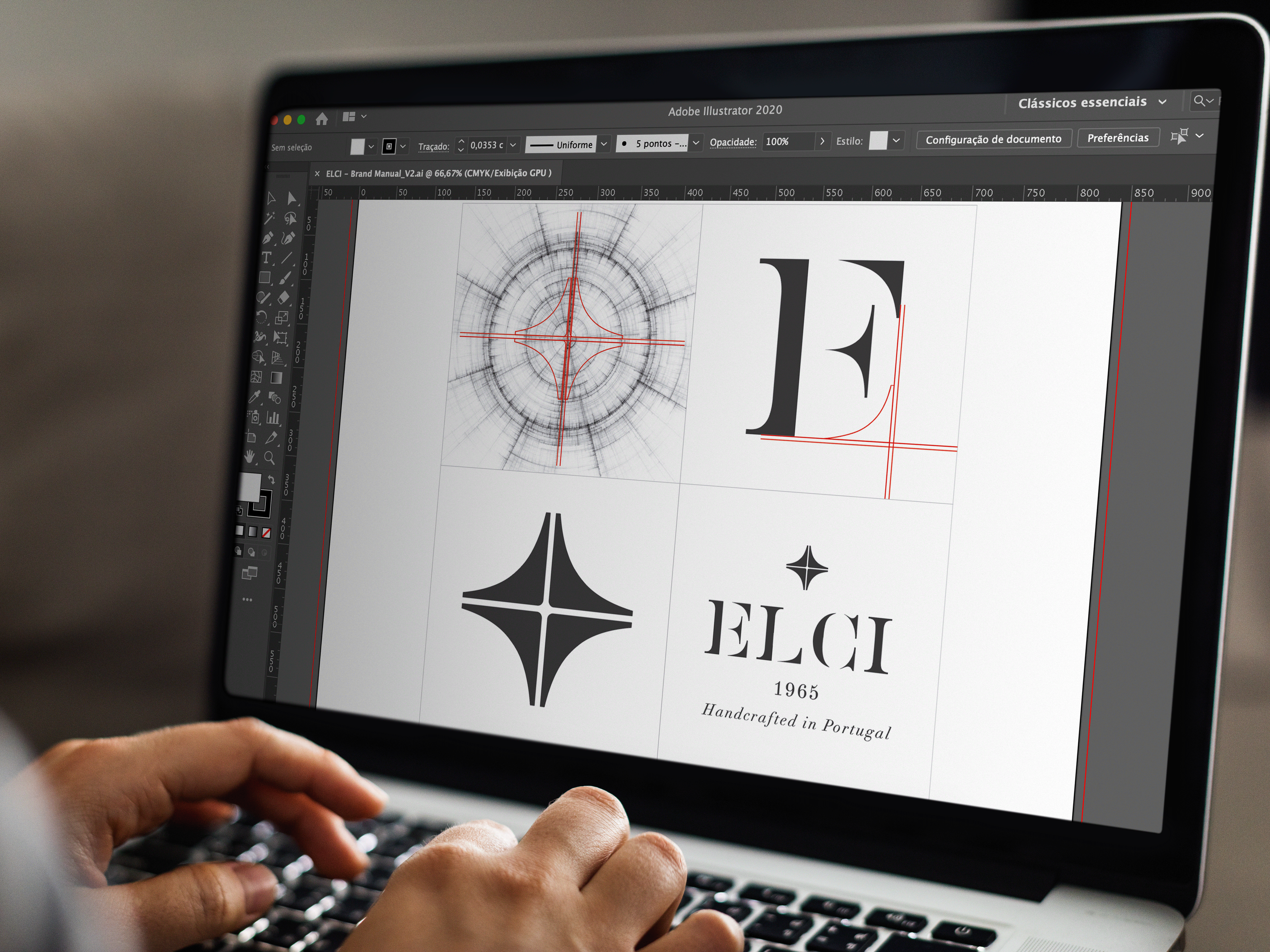
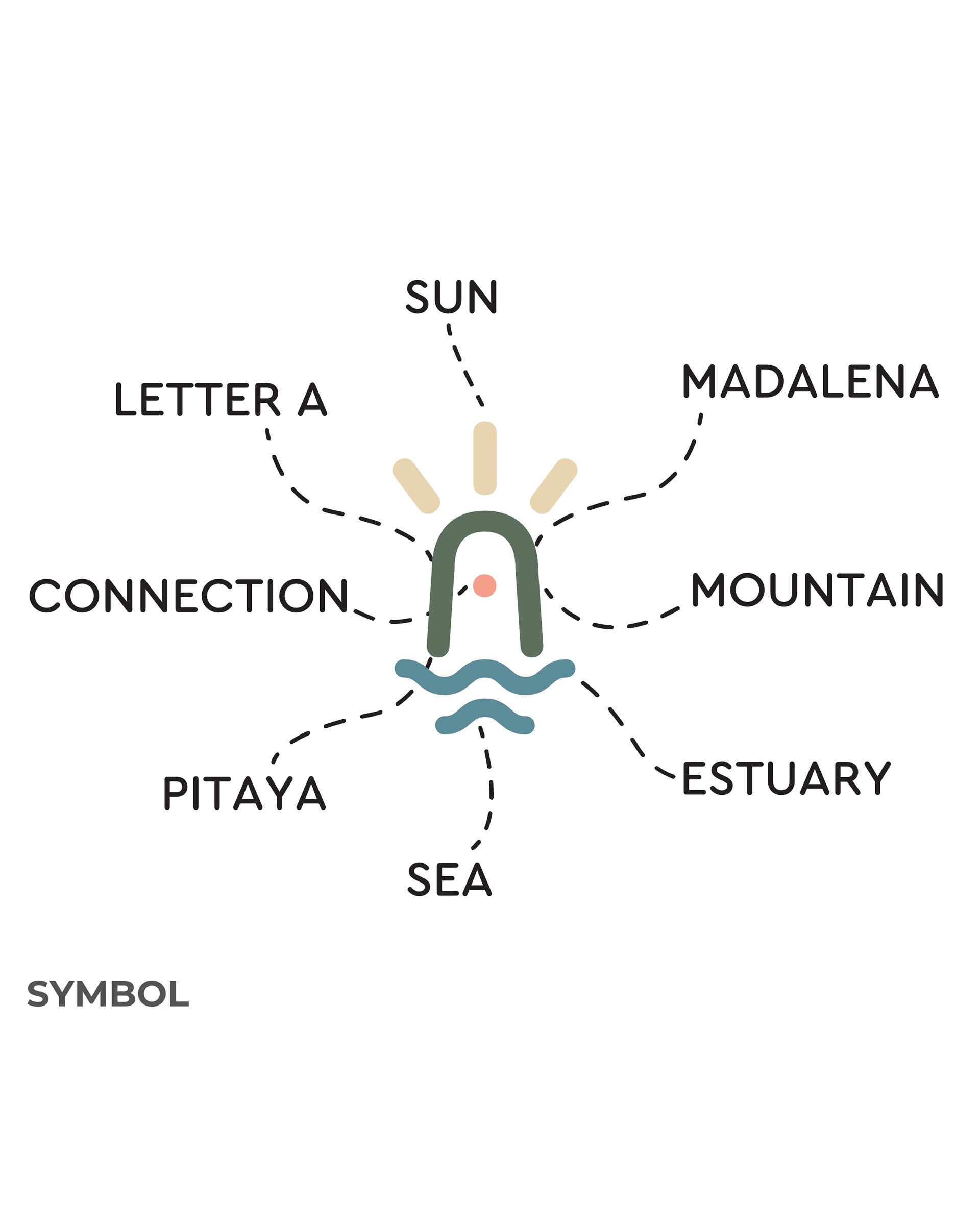
MA PI The name MAPI is inspired by the daughter and dog of the brand's founders.
MA from MAdalena PI from PItaya After several studies, the emotional connection ended up being the one that made the most sense, combining ease of memorization and similar phonetics in different languages.
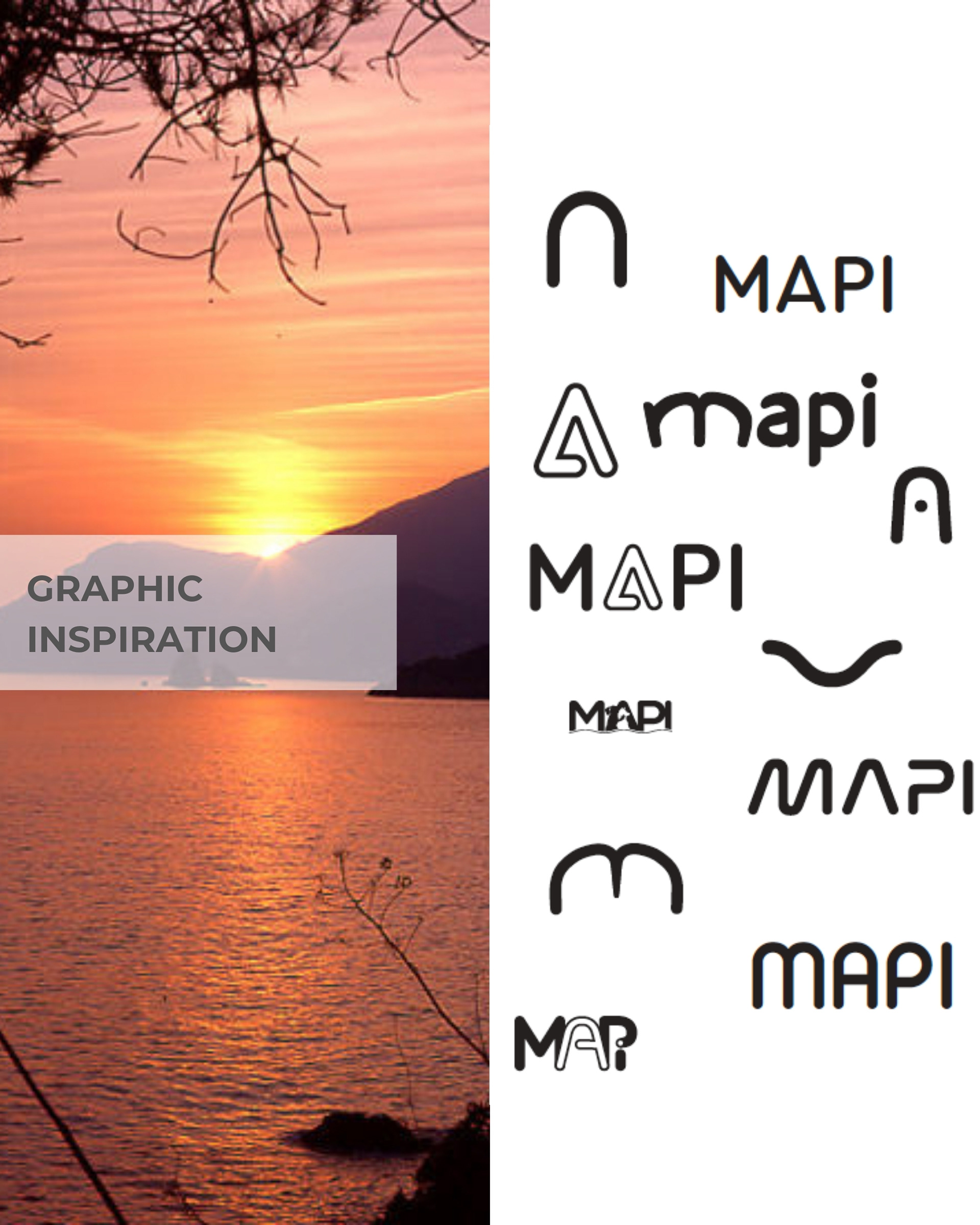
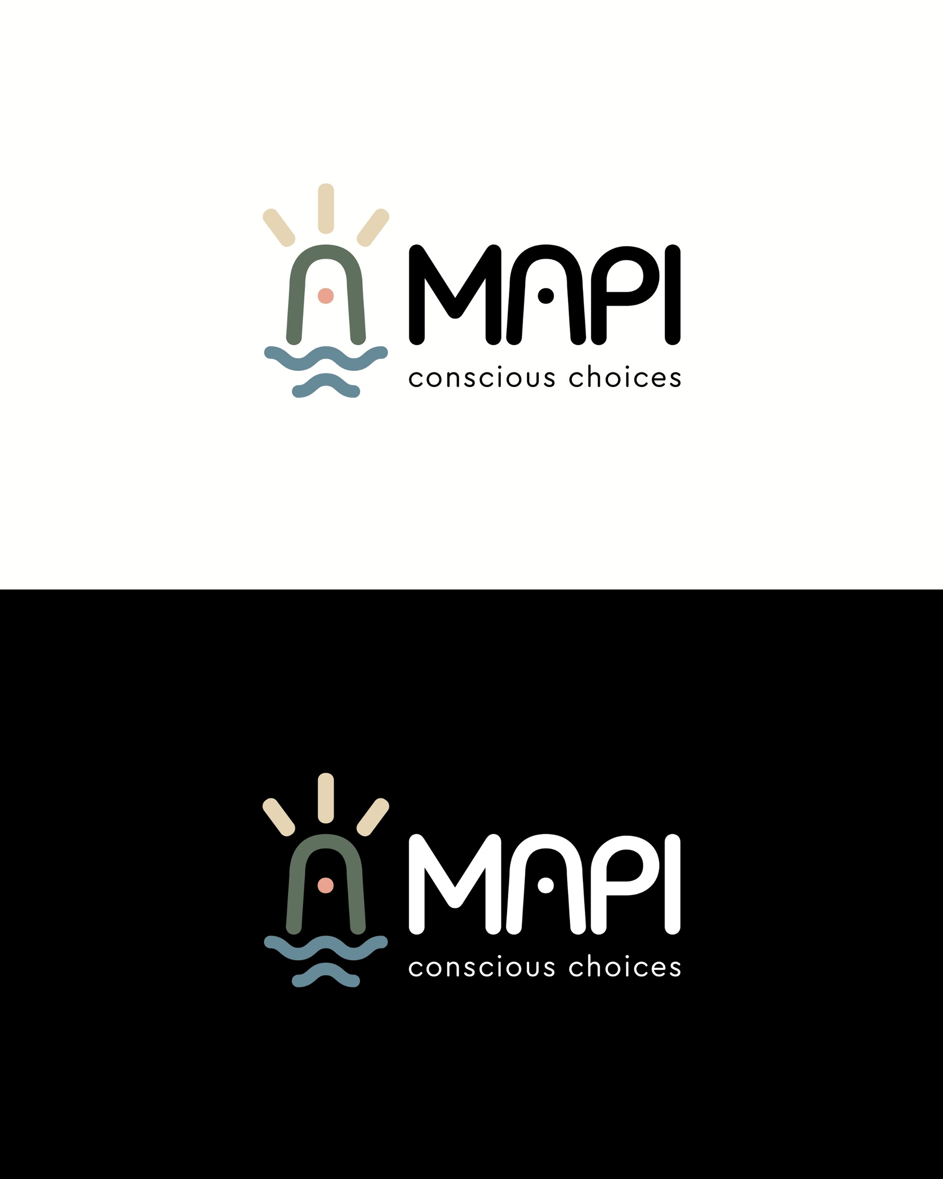
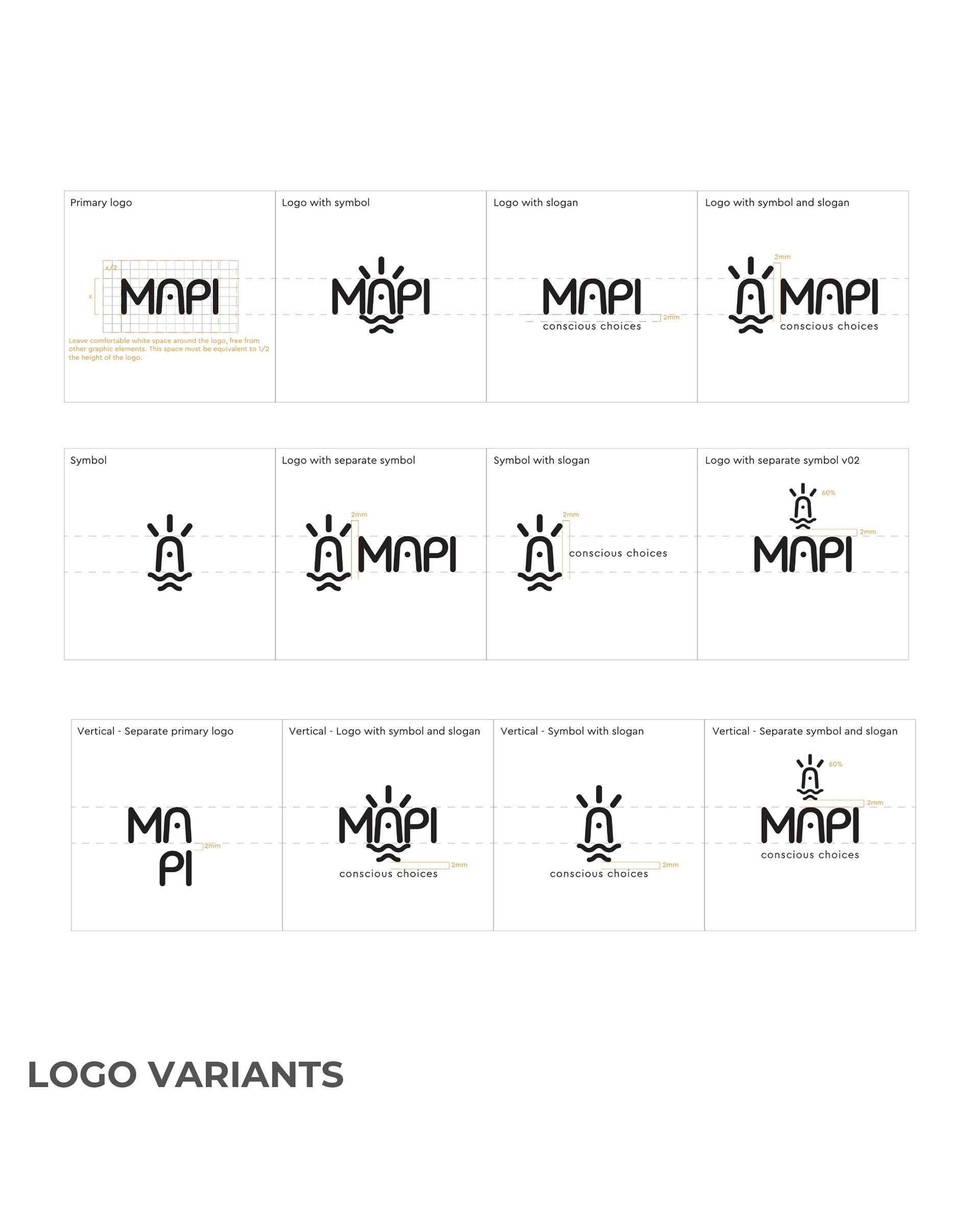
The MAPI logo uses a simple and distinctive sans serif font.
Its geometric structure, with rounded corners, provides harmony in a relaxed and modern style that represents the brand well.
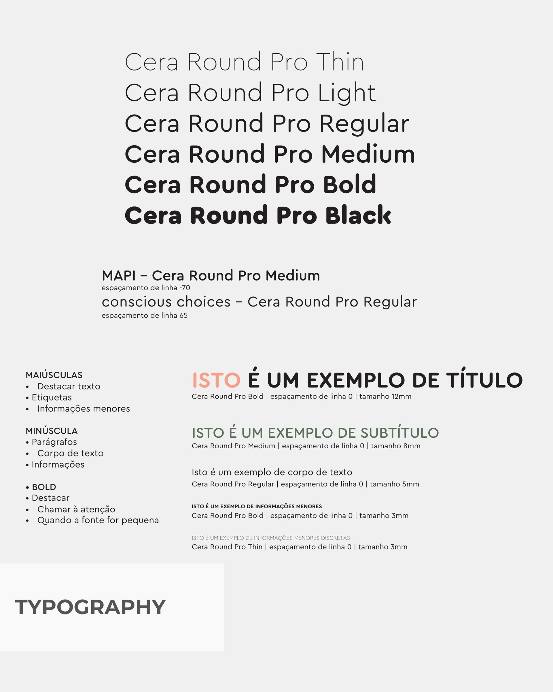
Cera Round Pro is a modern sans serif font family. It was designed by Jakob Runge, Lisa Fischbach and published by TypeMates.
Drawing on the tradition of machine-milled lettering and combining it with the technical geometry of Cera, it features circular stroke ends and gently rounded corners to create a lively text.
With 6 thickness variants from “Thin” to “Black”, they allow a wide range of expression in typography, where the lightest ones have all the cleanliness and precision of technical drawings and the heavier ones are playful and soft: perfect for strong highlights.