Lazuli - identity manual + visual identity
Project: LAZULI BRAND
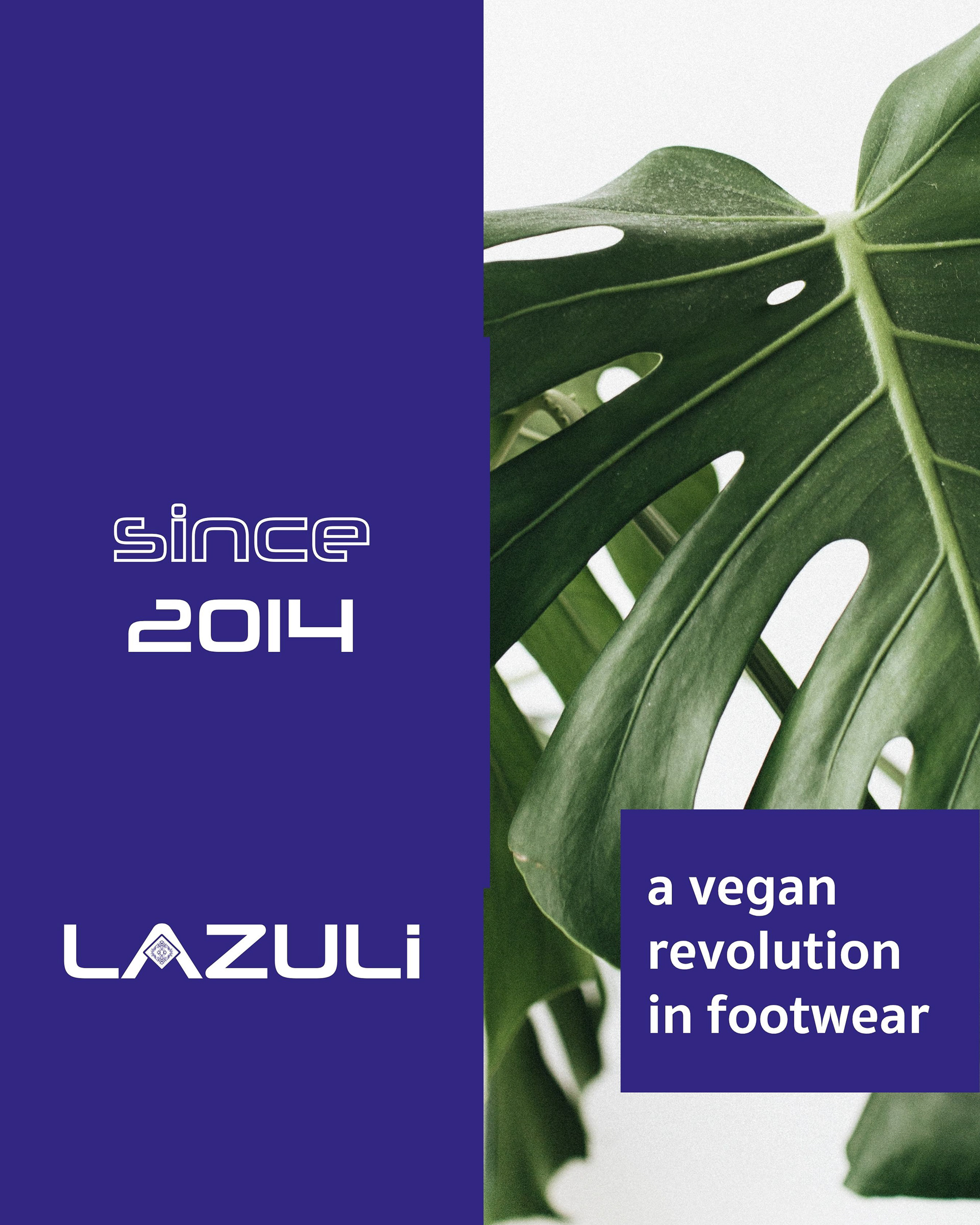
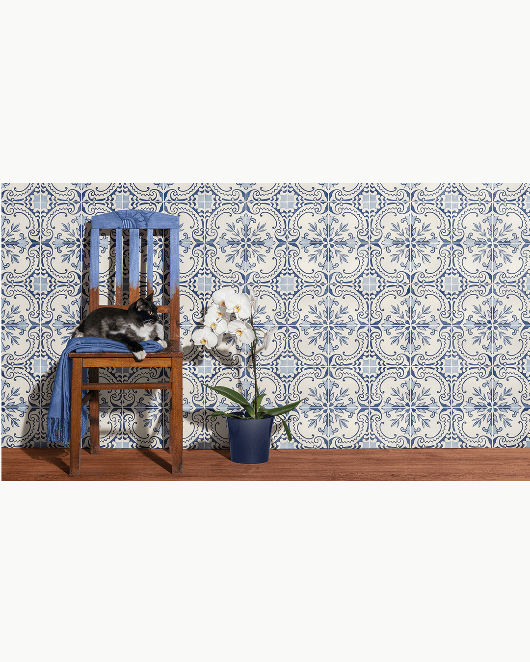
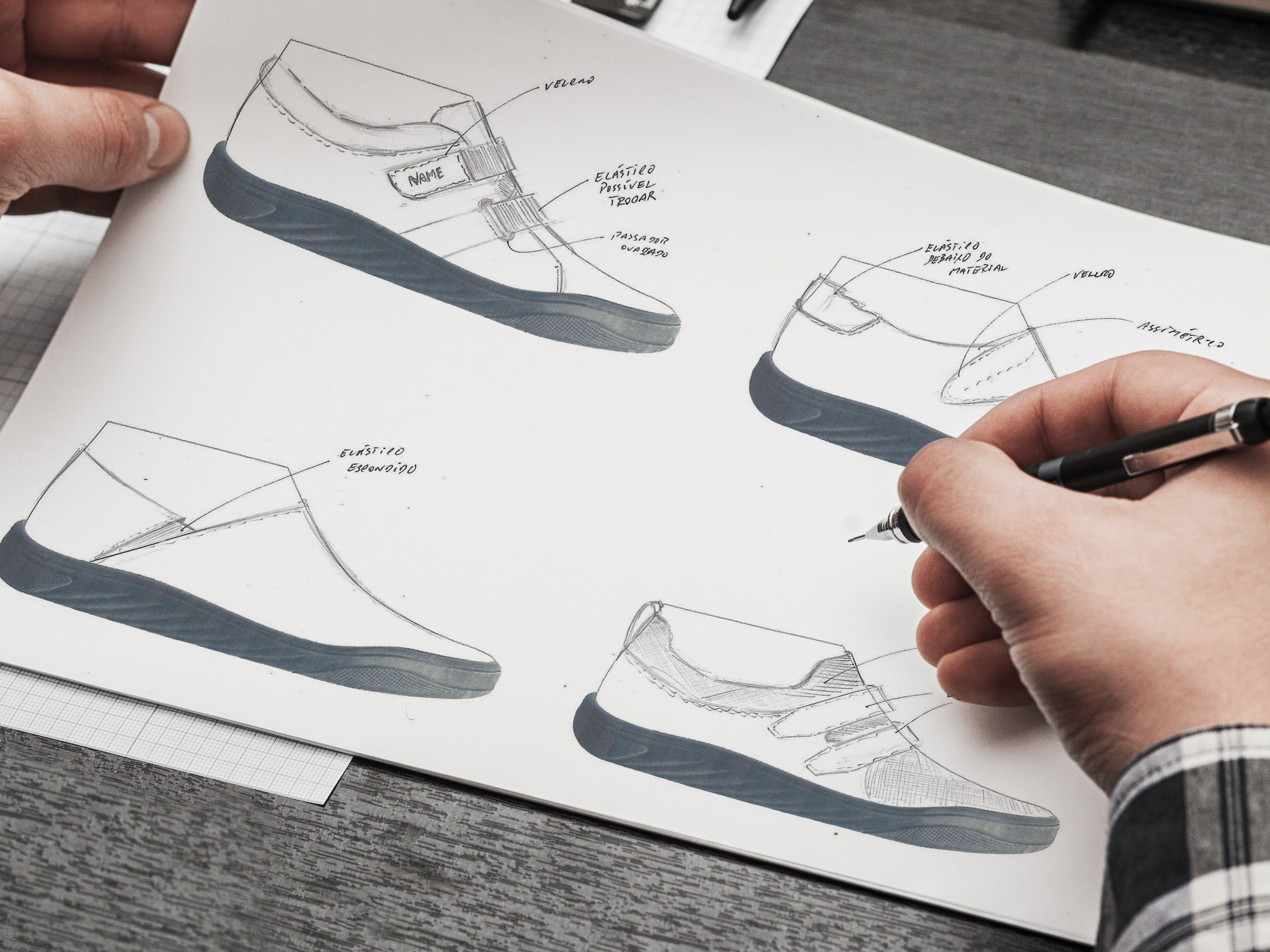
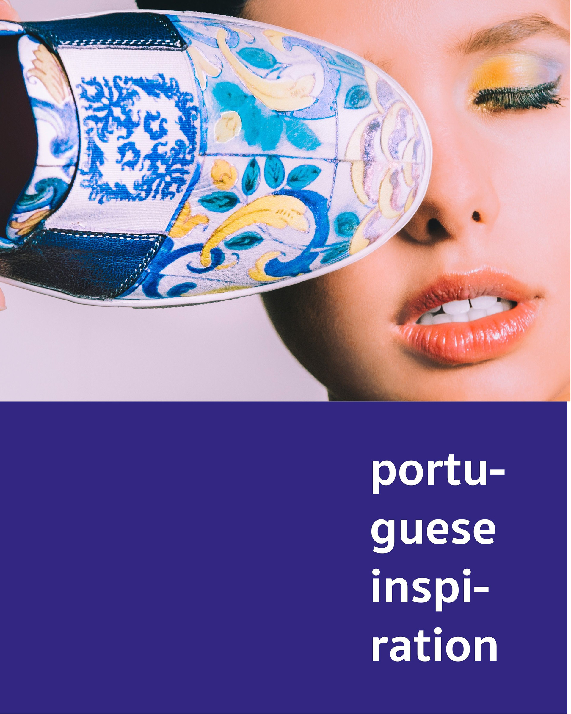
Lazuli was born in 2014 with a mission: to blend women’s footwear with the beauty and heritage of Portuguese tiles. These iconic patterns, deeply rooted in our culture, serve as the starting point and inspiration behind brand identity.
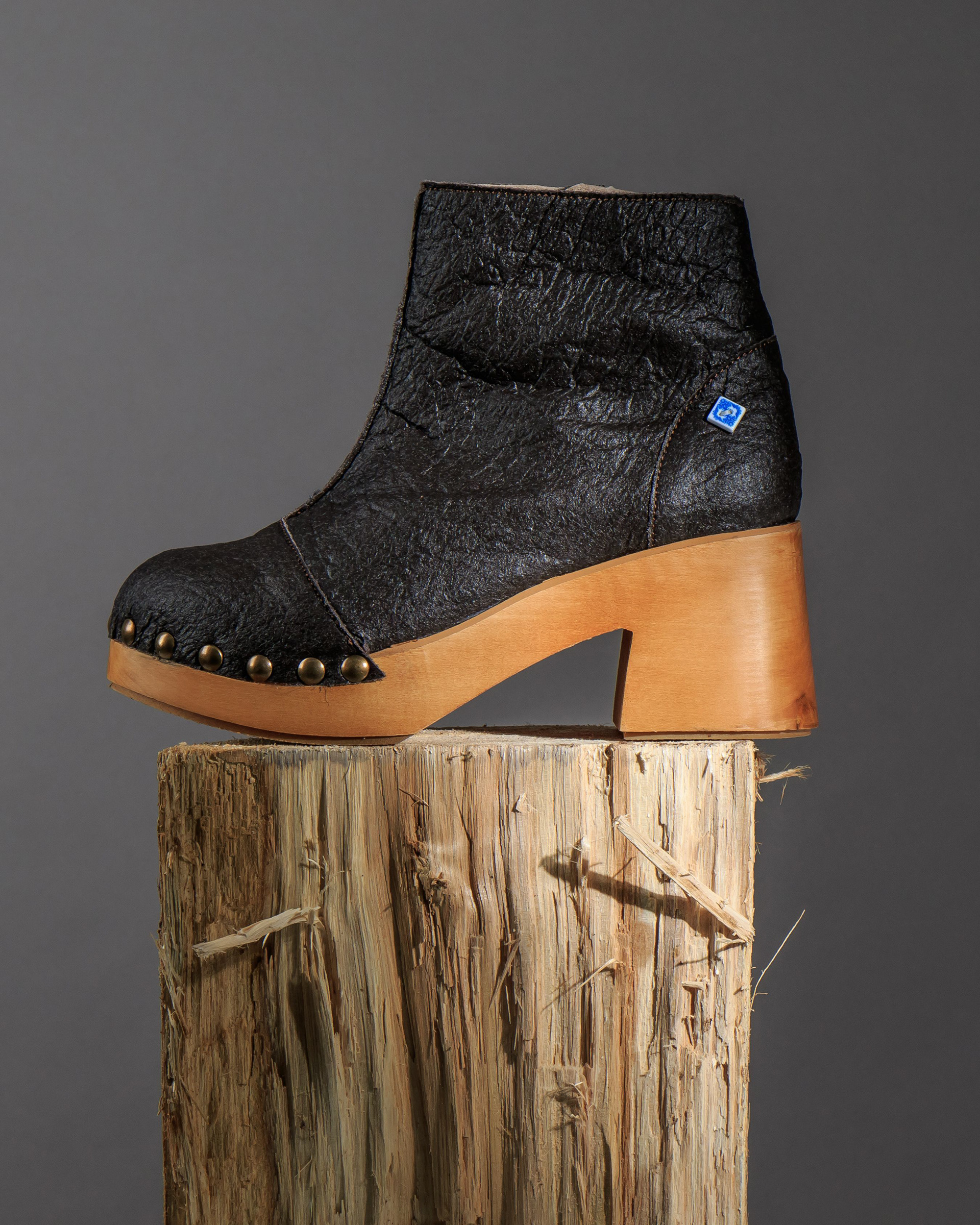
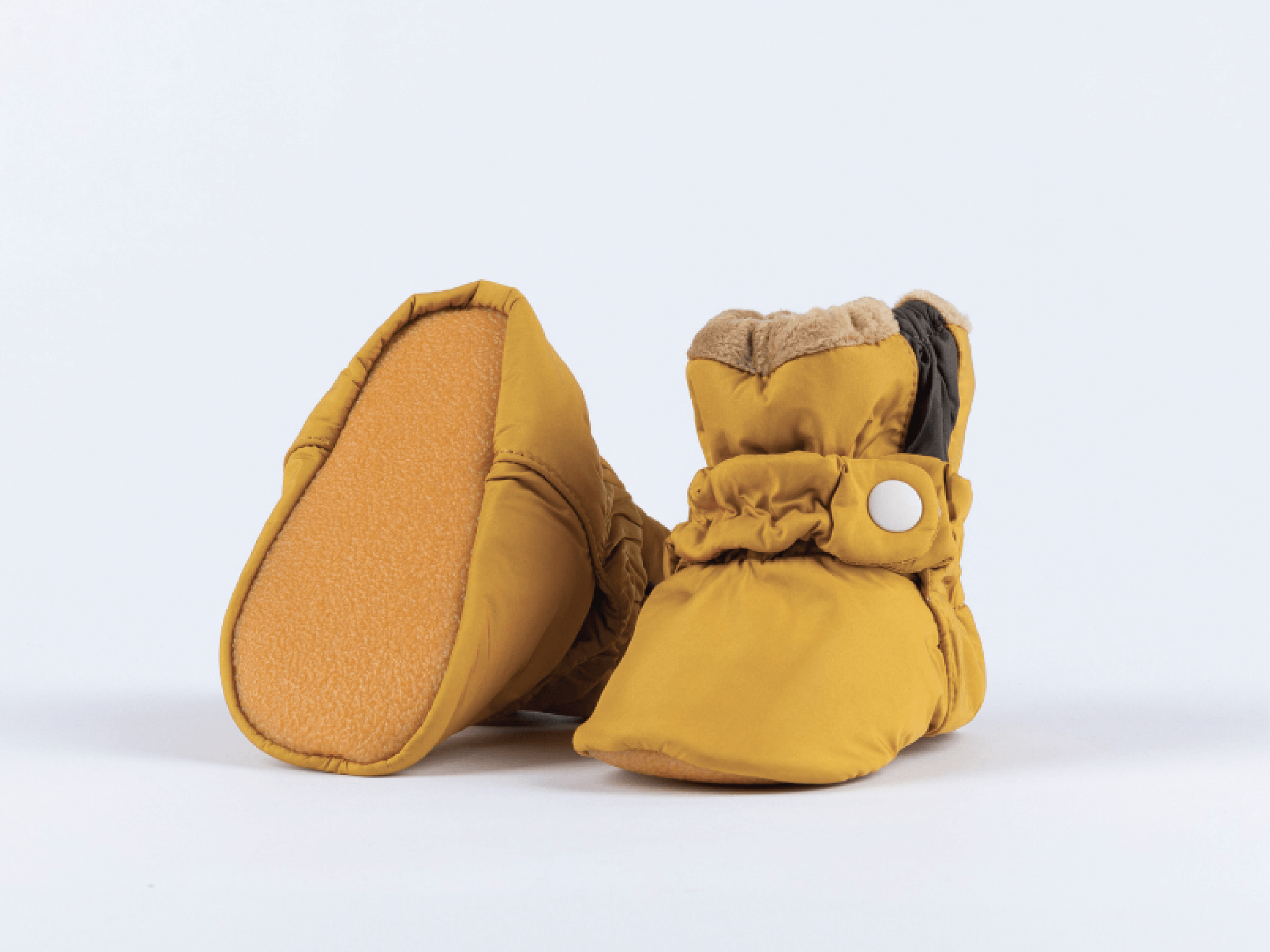
Since 2020, all of our models are free from animal-derived materials, and we’re committed to using increasingly sustainable solutions.
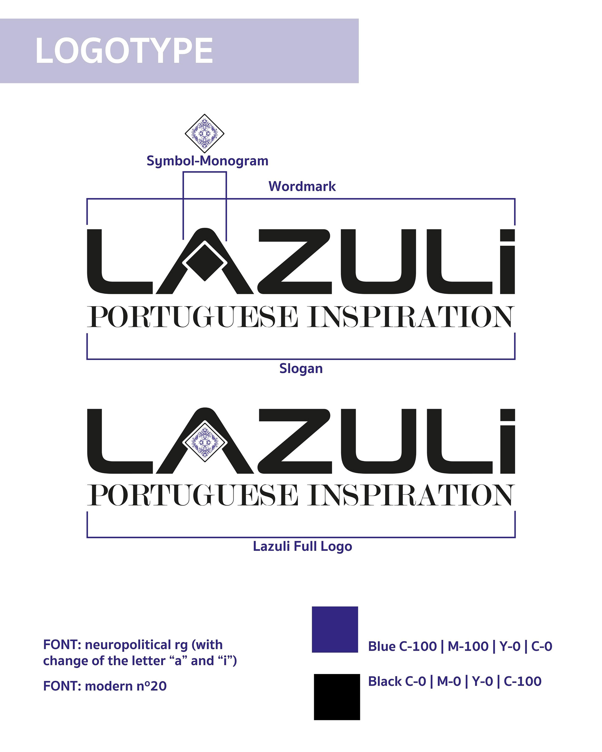
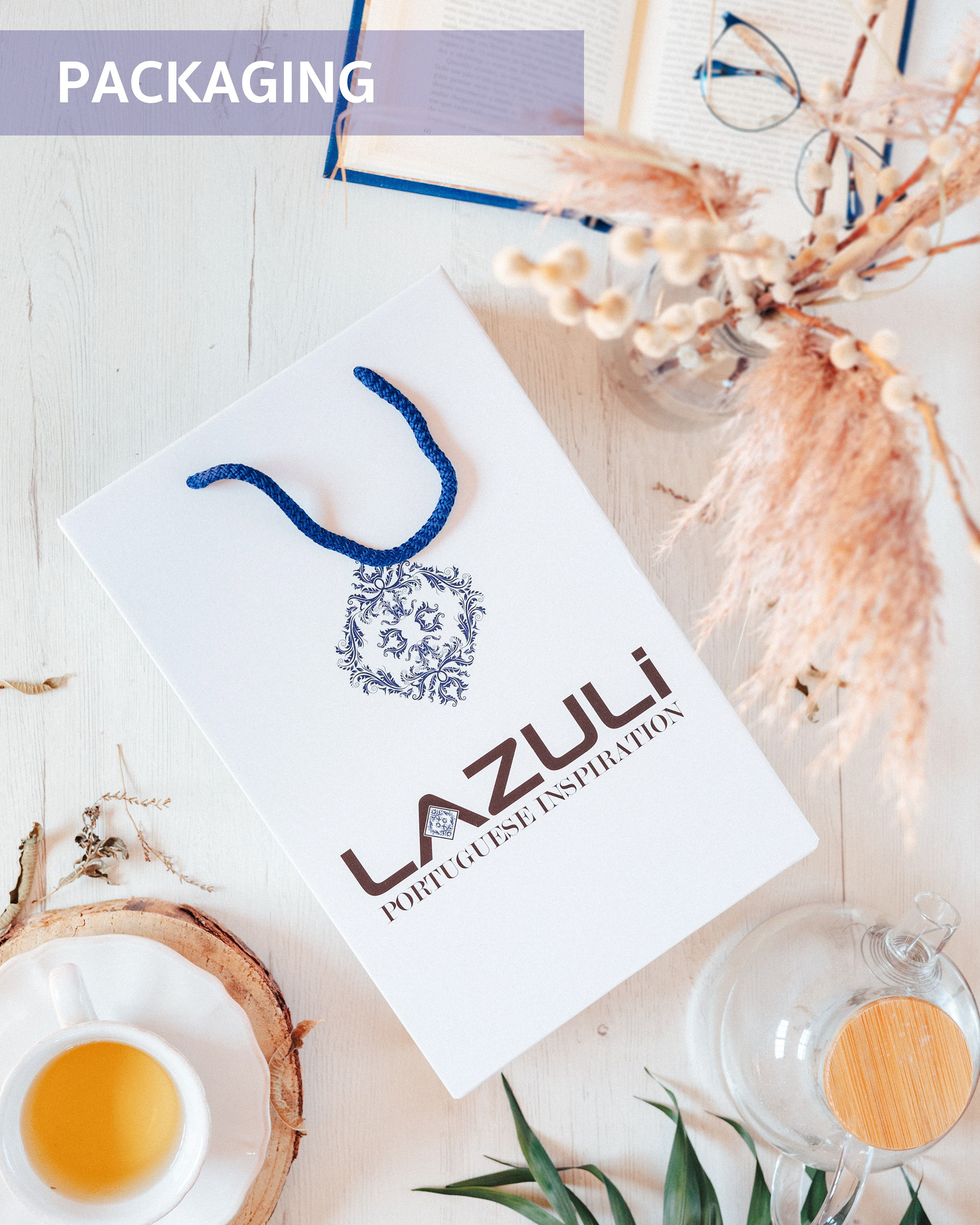
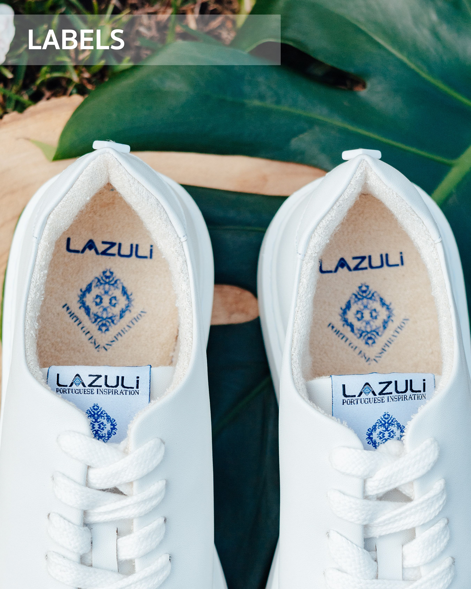
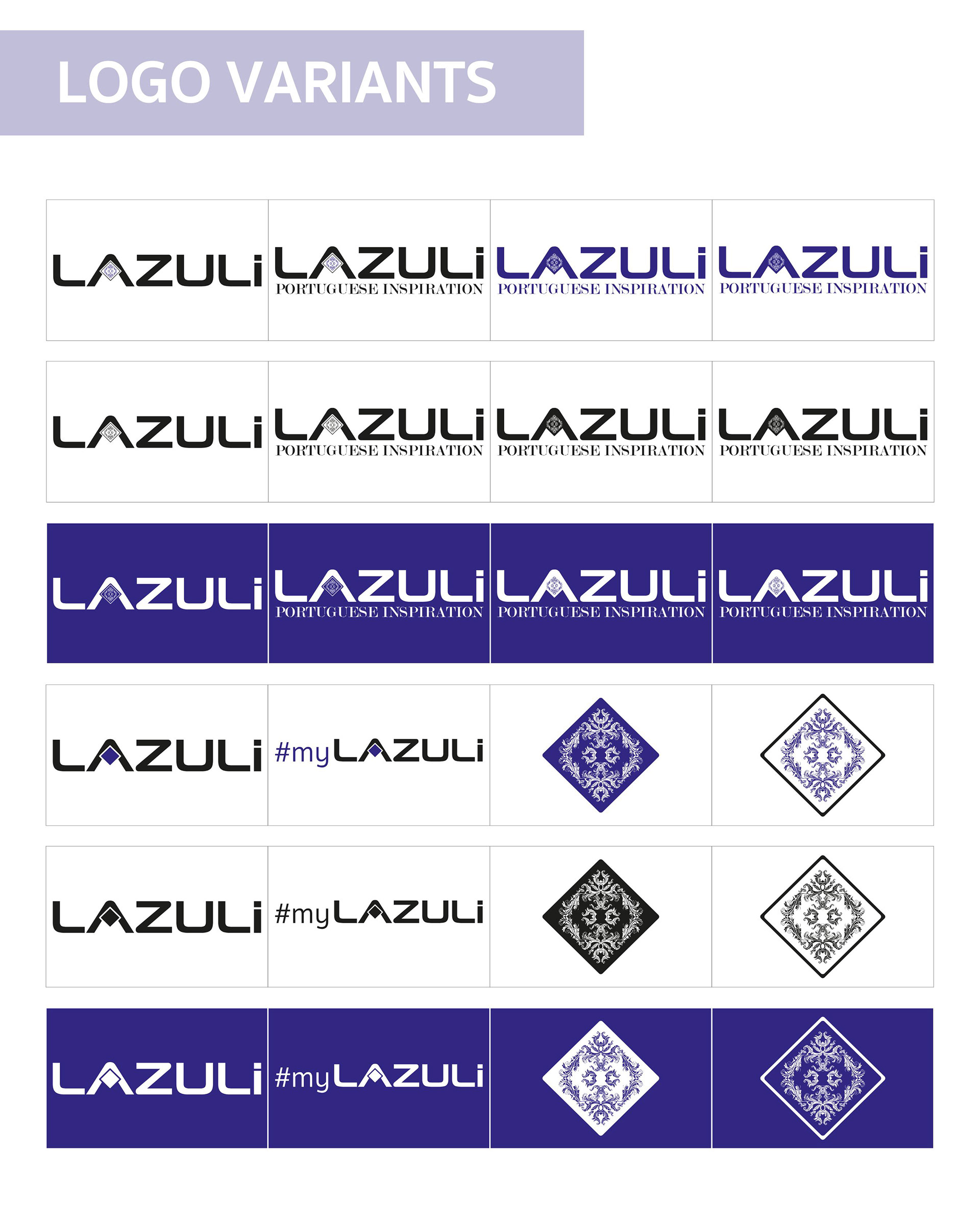
The LAZULI logo is an important expression of the brand's identity. The design is easily adaptable to different communication contexts. The wordmark is recognizable and highly visible. SYMBOL-MONOGRAM: Represents a tile that evokes Portuguese culture. It was rotated 45º to fit in the center of the "A." The color is a vibrant blue, so common in Portuguese tiles.

Although the logo and slogan use different fonts, all promotional and communication text is written in a different font. The titles and header are in GoodTimes-Regular. The body is in Sukhumvit.